Slides: A11y Series: Buttons
There are 17 slides. Each one has a picture of the slide, followed by its text and a description of what it shows.
Slides for “A11y Series: Buttons” (PDF, 492KB). The PDF isn’t fully accessible, but this page has everything it does.
Slide 1
The title slide. It reads “Buttons”, in large bold black text on the screen of a drawing of a phone, on a blue background. The phone’s status bar shows the time “10.46”, with wifi, signal and battery icons. Below the title, on the phone’s screen, is a grey button reading “Oh no!”.
Slide 2
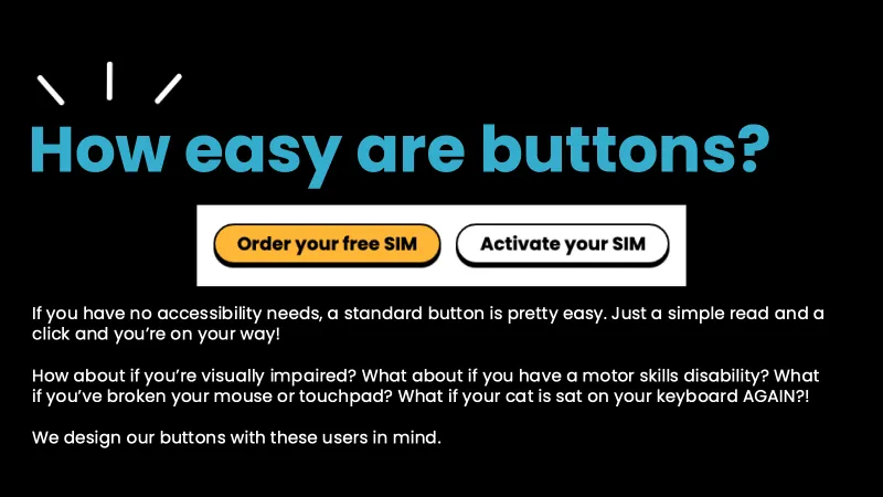
The heading “How easy are buttons?”, in large blue text on a black background. Like all the slides that follow, it has 3 short white lines above the heading, like a little burst.
Below the heading are two giffgaff buttons for a SIM card: a yellow one reading “Order your free SIM” and a white one reading “Activate your SIM”. Under them, the text:
“If you have no accessibility needs, a standard button is pretty easy. Just a simple read and a click and you’re on your way!
How about if you’re visually impaired? What about if you have a motor skills disability? What if you’ve broken your mouse or touchpad? What if your cat is sat on your keyboard AGAIN?!
We design our buttons with these users in mind.”
Slide 3
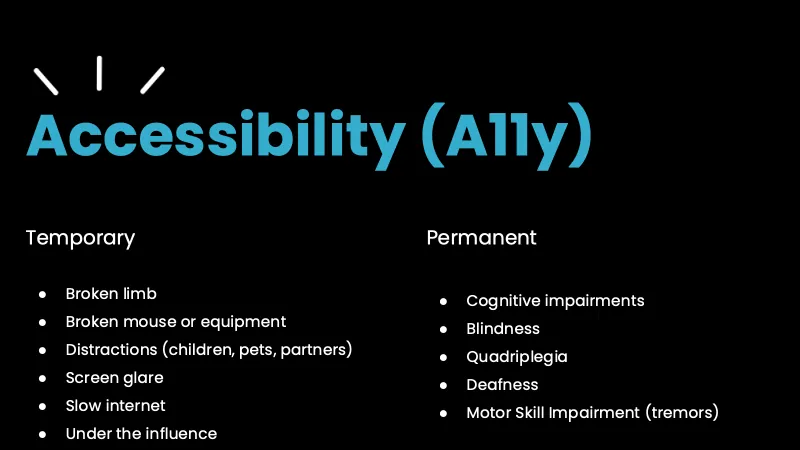
The heading “Accessibility (A11y)”, with 2 lists side by side.
On the left, “Temporary”:
- “Broken limb”
- “Broken mouse or equipment”
- “Distractions (children, pets, partners)”
- “Screen glare”
- “Slow internet”
- “Under the influence”
On the right, “Permanent”:
- “Cognitive impairments”
- “Blindness”
- “Quadriplegia”
- “Deafness”
- “Motor Skill Impairment (tremors)”
Slide 4
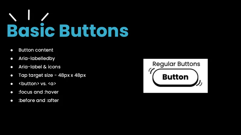
The heading “Basic Buttons”, with a list of the topics I cover. Two of them are Accessible Rich Internet Applications (ARIA) attributes.
- “Button content”
- “Aria-labelledby”
- “Aria-label & icons”
- “Tap target size”, followed by a dash and “48px x 48px”
- “<button> vs. <a>”
- “:focus and :hover”
- “:before and :after”
On the right is a picture of a plain white button with a black outline, reading “Button”, under the label “Regular Buttons”. Small curved lines at its corners make it look like it’s wobbling.
The next 8 slides keep this list down the left side, with the current topic in bold. From slide 6 onwards, the fourth item is shortened to “Tap target size”.
Slide 5
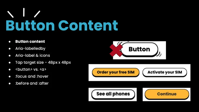
The heading “Button Content”. In the list, “Button content” is bold.
On the right, the plain “Button” button from the last slide, crossed out with a big red cross. Below it are real giffgaff buttons: “Order your free SIM” in yellow, “Activate your SIM” in white, “See all phones” in white and “Continue” in yellow.
Slide 6
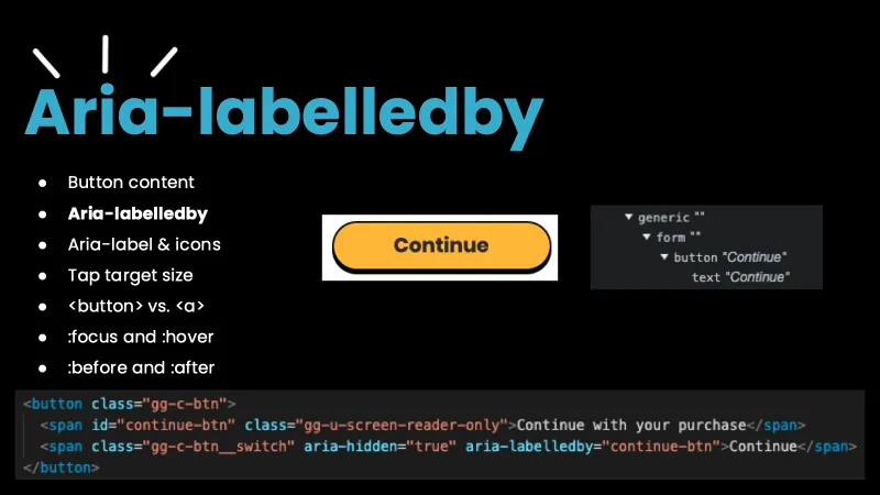
The heading “Aria-labelledby”. In the list, “Aria-labelledby” is bold.
In the middle is the yellow “Continue” button. To its right is a screenshot of Chrome’s accessibility tree for it:
generic ""
  form ""
    button "Continue"
      text "Continue"
Along the bottom is the code for the button:
<button class="gg-c-btn">
  <span id="continue-btn" class="gg-u-screen-reader-only">Continue with your purchase</span>
  <span class="gg-c-btn__switch" aria-hidden="true" aria-labelledby="continue-btn">Continue</span>
</button>
Slide 7
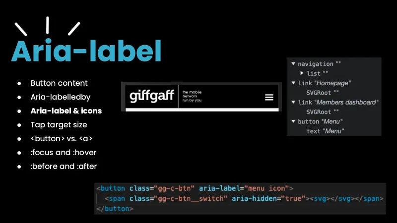
The heading “Aria-label”. In the list, “Aria-label & icons” is bold.
In the middle is the giffgaff header on mobile: the giffgaff logo, the words “the mobile network run by you”, and a menu icon made of 3 lines on the right. To its right is a screenshot of Chrome’s accessibility tree for the header:
navigation ""
  list ""
  link "Homepage"
    SVGRoot ""
  link "Members dashboard"
    SVGRoot ""
  button "Menu"
    text "Menu"
Along the bottom is the code for the menu button:
<button class="gg-c-btn" aria-label="menu icon">
  <span class="gg-c-btn__switch" aria-hidden="true"><svg></svg></span>
</button>
Slide 8
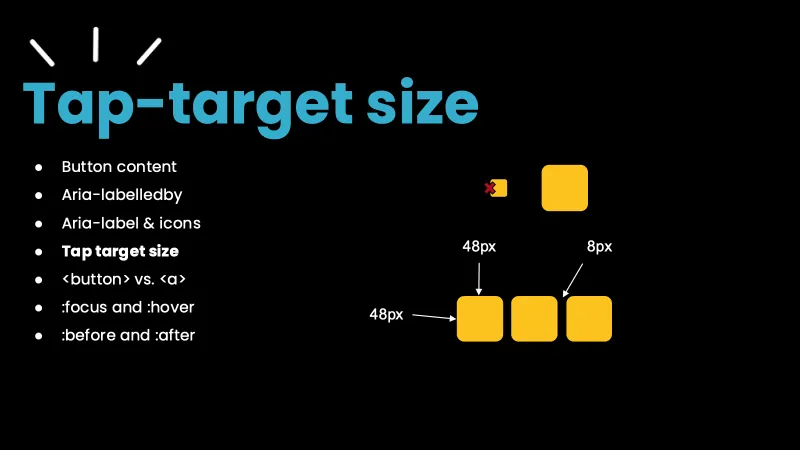
The heading “Tap-target size”. In the list, “Tap target size” is bold.
On the right, a tiny yellow square crossed out with a small red cross, next to a much bigger yellow square. Below them are 3 big yellow squares in a row. Arrows label them: “48px” for the width of the first square, “48px” for its height, and “8px” for the gap between the squares.
Slide 9
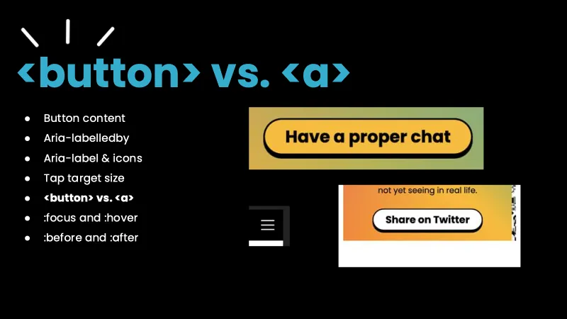
The heading “<button> vs. <a>”. In the list, “<button> vs. <a>” is bold.
On the right are 3 examples from the giffgaff site:
- A yellow “Have a proper chat” button, on a yellow and green background.
- The menu icon made of 3 lines, from the mobile header.
- A white “Share on Twitter” button on an orange card. Above it, cut off, is the end of the card’s text: “not yet seeing in real life.”
Slide 10
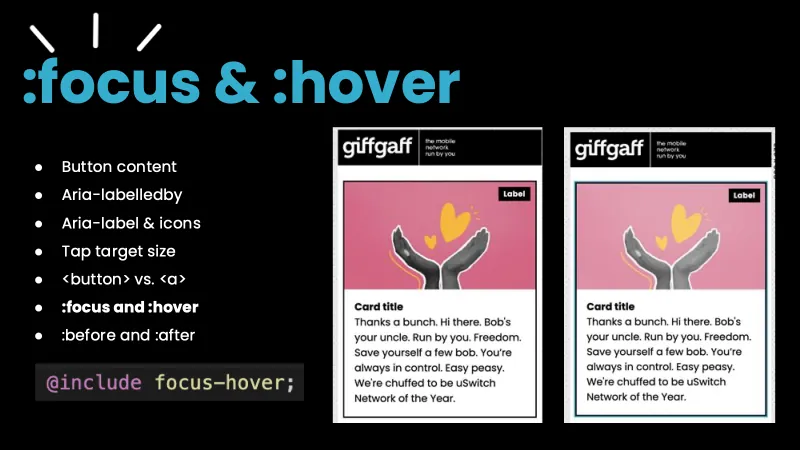
The heading “:focus & :hover”. In the list, “:focus and :hover” is bold. Below the list is a line of code:
@include focus-hover;
On the right are 2 copies of the same giffgaff card, each under the giffgaff header. The card has a pink picture of two grey hands held up under a yellow heart, with a black “Label” tag in the corner. Below the picture is the text “Card title”, then “Thanks a bunch. Hi there. Bob’s your uncle. Run by you. Freedom. Save yourself a few bob. You’re always in control. Easy peasy. We’re chuffed to be uSwitch Network of the Year.”
The first card has only a thin black border, so there’s no focus style. The second card has a blue outline around it, which is our focus and hover style.
Slide 11
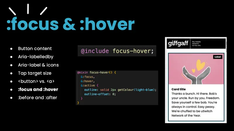
The heading “:focus & :hover”. In the list, “:focus and :hover” is still bold.
In the middle is the same line of code as the last slide, and below it the code for the focus-hover mixin:
@include focus-hover;

@mixin focus-hover() {
  &:focus,
  &:hover,
  &:active {
    outline: solid 2px getColour(light-blue);
    outline-offset: 0;
  }
}
On the right is the card with the blue outline from the last slide.
Slide 12
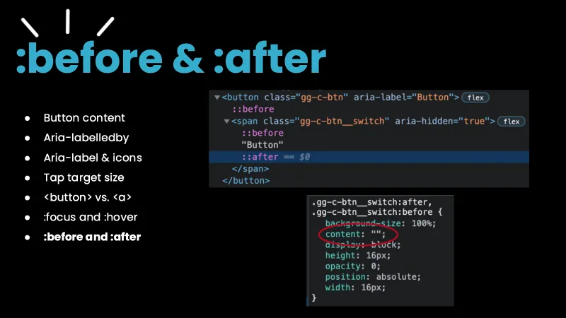
The heading “:before & :after”. In the list, “:before and :after” is bold.
On the right is a screenshot of the elements panel in Chrome’s developer tools, showing a button with before and after pseudo-elements inside it. The “::after” line is highlighted, as it’s selected.
<button class="gg-c-btn" aria-label="Button">
  ::before
  <span class="gg-c-btn__switch" aria-hidden="true">
    ::before
    "Button"
    ::after == $0
  </span>
</button>
Below it is a screenshot of the CSS for the pseudo-elements, from the styles panel of the developer
tools. The line content: ""; is circled in red.
.gg-c-btn__switch:after,
.gg-c-btn__switch:before {
  background-size: 100%;
  content: "";
  display: block;
  height: 16px;
  opacity: 0;
  position: absolute;
  width: 16px;
}
Slide 13
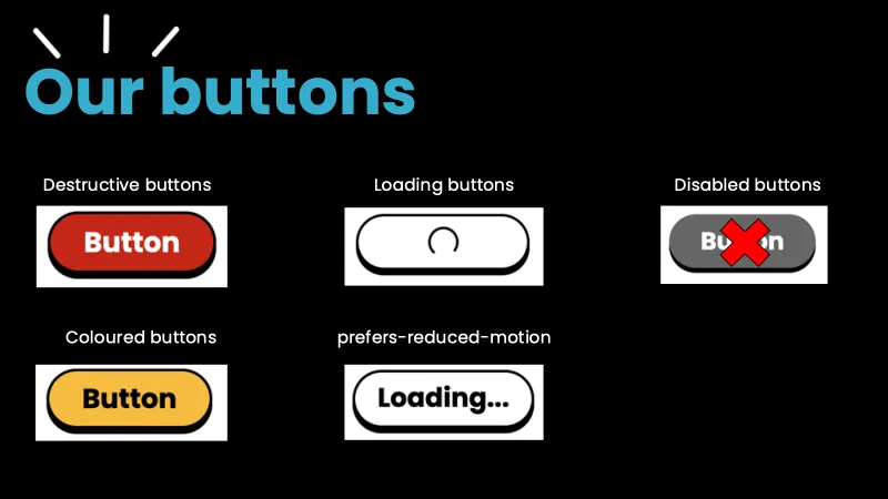
The heading “Our buttons”, with 5 labelled pictures of giffgaff buttons:
- “Destructive buttons”: a red button reading “Button”.
- “Loading buttons”: a white button with a spinning circle inside it, instead of text.
- “Disabled buttons”: a grey button reading “Button”, crossed out with a big red cross.
- “Coloured buttons”: a yellow button reading “Button”.
- “prefers-reduced-motion”: a white button reading “Loading...”, instead of the spinning circle.
Slide 14
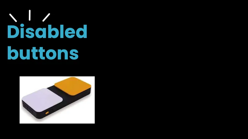
The heading “Disabled buttons”, with a photo of a switch: a flat black box with 2 large square buttons on top, one a pale, almost white colour and one orange.
Slide 15
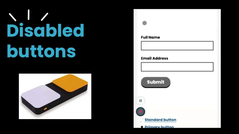
The same heading and photo of a switch as the last slide. On the right is a still from a short video I played in the talk. It shows a form with 2 empty fields, “Full Name” and “Email Address”, and a grey “Submit” button. Below the form are the controls of the screen recorder, and the start of 2 cut-off links, “Standard button” and “Primary button”.
In the video, the name “abi harrison” is typed in, then an email address with the @ missing. The Submit button stays grey.
Slide 16
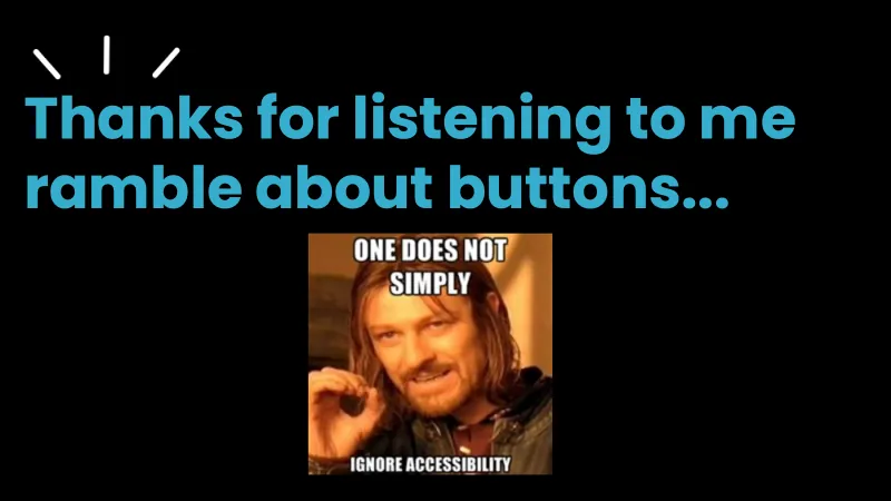
The heading “Thanks for listening to me ramble about buttons...”. Below it is a meme of Boromir from The Lord of the Rings, making a circle with his finger and thumb. The text on it reads “One does not simply ignore accessibility”, in white capital letters.
Slide 17
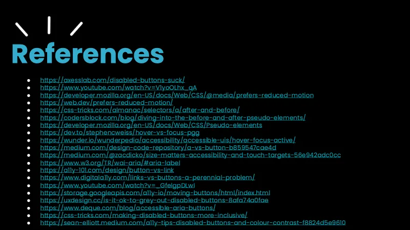
The heading “References”, with a list of 20 links. On the slide, each one is shown as its full web address.
- Axess Lab: Disabled buttons suck (external site)
- YouTube: “Assistive Tech: Switch Device” (external site)
- MDN Web Docs: prefers-reduced-motion (external site)
- web.dev: prefers-reduced-motion (external site)
- CSS-Tricks: ::after and ::before (external site)
- Coder’s Block: Diving into the ::before and ::after pseudo-elements (external site)
- MDN Web Docs: Pseudo-elements (external site)
- DEV: Hover vs focus (external site)
- Wunder: Hover, focus and active (external site)
- Medium: a vs button (external site)
- Medium: Size matters, accessibility and touch targets (external site)
- World Wide Web Consortium (W3C): the aria-label section of the ARIA specification (external site)
- A11y-101: Button vs link (external site)
- Digital A11Y: Links vs buttons, a perennial problem (external site)
- YouTube: “It’s the markup that matters: on Accessibility Tree and the Accessibility Object Model” (external site)
- a11y.io: Moving buttons demo (external site)
- UX Collective: Is it OK to grey out disabled buttons? (external site)
- Deque: Accessible ARIA buttons (external site)
- CSS-Tricks: Making disabled buttons more inclusive (external site)
- Medium: A11y tips, disabled buttons and colour contrast (external site)