Slides: Moving accessibility from debt to done at giffgaff
There are 39 slides. Each one has a picture of the slide, followed by its text and a description of what it shows.
Slides for “Moving accessibility from debt to done at giffgaff” (PDF, 1.3MB). The PDF isn’t fully accessible, but this page has everything it does.
Back to “Moving accessibility from debt to done at giffgaff”
Slide 1
The title slide, on giffgaff’s bright green. It reads “Moving accessibility from debt to done at giffgaff”, with the giffgaff logo and my name, Abi Harrison-Nye. The words “debt” and “done” are in bold, and the giffgaff logo is white text on a black box.
Slide 2
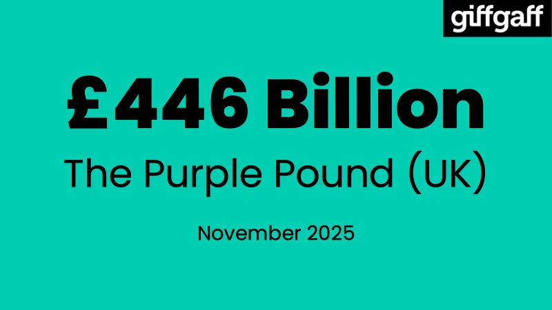
“£446 Billion. The Purple Pound (UK). November 2025.”
“£446 Billion” is in very large, bold text in the middle of the slide. The giffgaff logo is in the top right corner, as it is on most of the slides that follow.
Slide 3
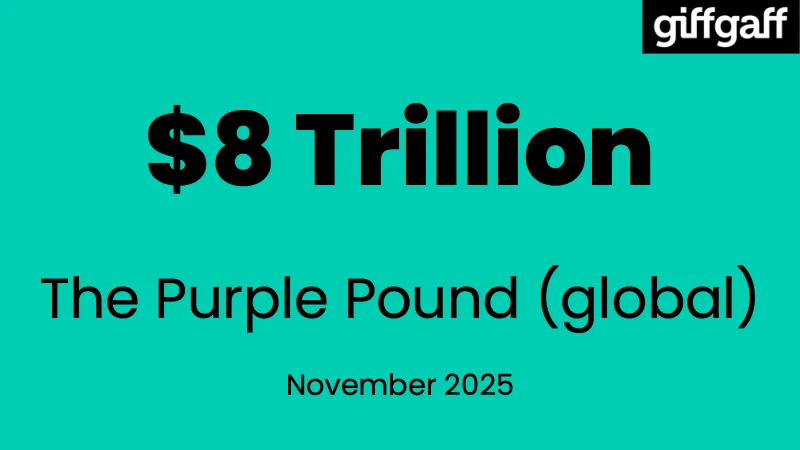
“$8 Trillion. The Purple Pound (global). November 2025.”
“$8 Trillion” is in very large, bold text in the middle of the slide.
Slide 4
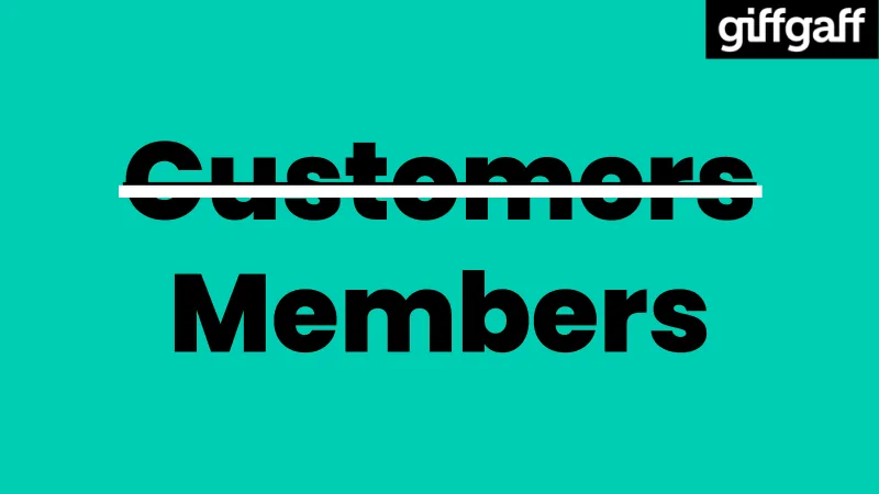
The word “Customers”, crossed out with a thick white line, with “Members” below it. Both words are in large, bold text.
Slide 5
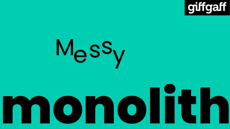
The words “Messy monolith”. The letters of “Messy” are jumbled, each at a different height. “monolith” is in very large, bold text along the bottom of the slide, filling its whole width.
Slide 6
The title slide again, “Moving accessibility from debt to done at giffgaff”, this time without my name.
Slide 7
The word “monolith” on its own, in very large, bold text across the middle of the slide.
Slide 8
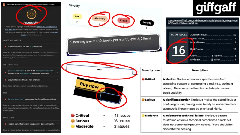
A collage of screenshots from the audit of our phone purchase journey, with the most important parts circled in red.
- A Lighthouse report for a page at “https://www.giffgaff.com/mobile-phones/apple/iphone-16/new/…” (external site). Its accessibility score of “83” is circled. It lists these issues, with one section for Accessible Rich Internet Applications (ARIA), under the headings “Names and labels”, “Best practices”, “ARIA” and “Navigation”:
- “Image elements do not have [alt] attributes”
- “[user-scalable="no"] is used in the <meta name="viewport"> element or the [maximum-scale] attribute is less than 5.”
- “Document does not have a main landmark.”
- “[aria-hidden="true"] elements contain focusable descendants”
- “Heading elements are not in a sequentially-descending order”
- A count of issues by severity: “Low 0”, “Moderate 2”, “Critical 3” and “Security 1”. “Moderate” and “Critical” are circled.
- A screen reader caption reading “heading level 3 £10, level 2 per month, level 2, 2 items”.
- An empty heading box with only the word “New” in it, circled.
- A yellow “Buy now” button, next to an empty black box with a blue focus outline and no label, circled.
- An automated scan of the page at “https://www.giffgaff.com/mobile-phones/apple/iphone-16/new/pay-today/phones-checkout/about-you” (external site). Its “Total issues” count of “16” is circled. Next to it: “Automatic Issues 16”, “Guided Issues 0”, “Manual Issues 0”, “Best Practice 12”, “Critical 1”, “Serious 2”, “Moderate 13” and “Minor 0”.
- The totals for the whole journey: “Critical: 43 issues”, “Serious: 16 issues” and “Moderate: 21 issues”, each with a coloured dot: red for critical, orange for serious and yellow for moderate.
A table explains each severity level:
| Severity Level | Description |
|---|---|
| Critical | A blocker. The issue prevents specific users from accessing content or completing a task (e.g. buying a phone). These must be fixed immediately to ensure basic usability. |
| Serious | A significant barrier. The issue makes the site difficult or confusing to use, forcing users to rely on workarounds or guesswork. These should be prioritised highly. |
| Moderate | A nuisance or technical failure. The issue causes frustration or fails a technical compliance check, but does not completely prevent access. These should be added to the backlog. |
Slide 9
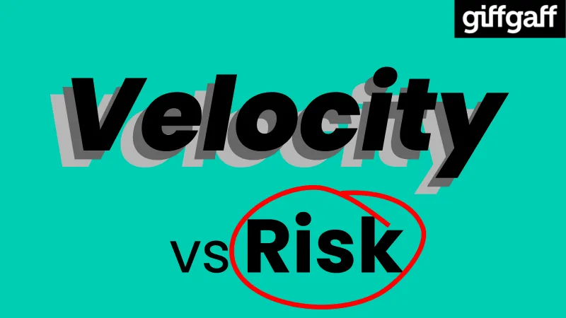
The words “Velocity vs Risk”. “Velocity” is in large, bold, slanted text, with two grey copies behind it, so it looks like it’s moving fast. “Risk” is circled in red.
Slide 10
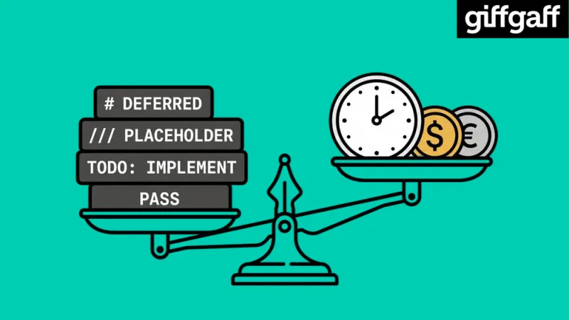
An illustration of a set of scales. On the left side, which is lower, is a stack of blocks labelled with code comments: “# DEFERRED”, “/// PLACEHOLDER”, “TODO: IMPLEMENT” and “PASS”. On the right side, which is higher, are a clock and two coins, one with a dollar sign and one with a euro sign.
Slide 11
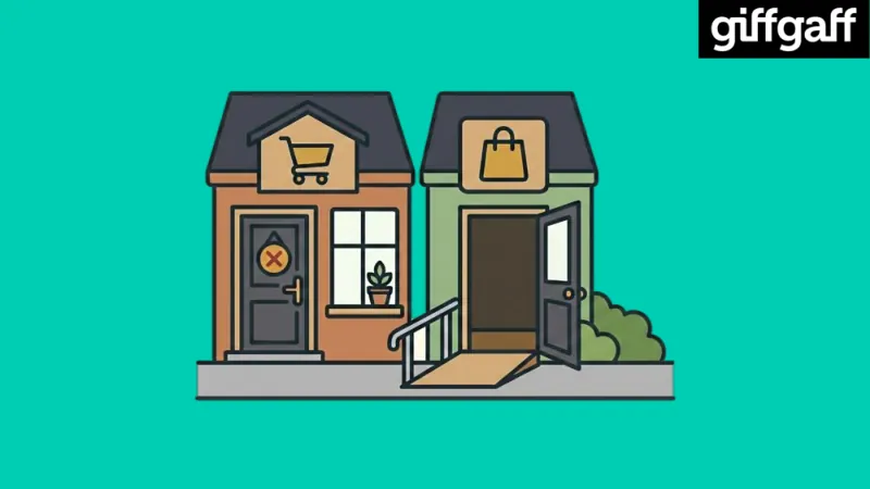
An illustration of two shops side by side. The first has a shopping trolley sign, and a locked door with a red cross hanging on it. The second has a shopping bag sign, an open door, and a ramp with a handrail leading up to it.
Slide 12
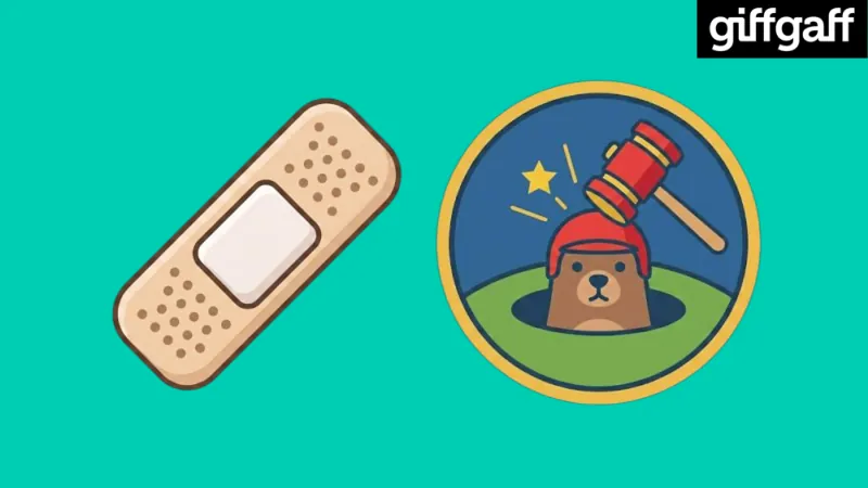
Two illustrations: a plaster, and a whack-a-mole game, with a mallet about to hit a mole wearing a red helmet as it comes out of its hole.
Slide 13
A pause symbol: two tall, light grey bars with black outlines.
Slide 14
A golden key.
Slide 15
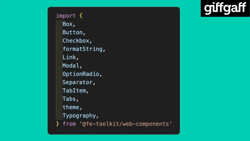
Code importing components from giffgaff’s component library:
import {
  Box,
  Button,
  Checkbox,
  formatString,
  Link,
  Modal,
  OptionRadio,
  Separator,
  TabItem,
  Tabs,
  theme,
  Typography,
} from '@fe-toolkit/web-components';
Slide 16
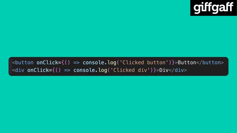
Two lines of code. The first is a button, and the second is a div with the same click handler:
<button onClick={() => console.log('Clicked button')}>Button</button>
<div onClick={() => console.log('Clicked div')}>Div</div>
Slide 17
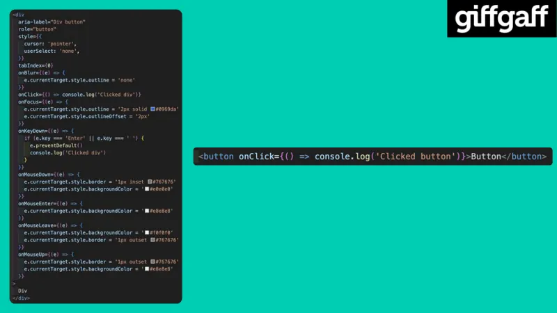
On the left, the div version again, now around 50 lines long, adding a label, a role, a tab index, and handlers for focus, blur, key presses, clicks and the mouse, to make it behave like a button:
<div
  aria-label="Div button"
  role="button"
  style={{
    cursor: 'pointer',
    userSelect: 'none',
  }}
  tabIndex={0}
  onBlur={(e) => {
    e.currentTarget.style.outline = 'none';
  }}
  onClick={() => console.log('Clicked div')}
  onFocus={(e) => {
    e.currentTarget.style.outline = '2px solid #0969da';
    e.currentTarget.style.outlineOffset = '2px';
  }}
  onKeyDown={(e) => {
    if (e.key === 'Enter' || e.key === ' ') {
      e.preventDefault();
      console.log('Clicked div');
    }
  }}
  onMouseDown={(e) => {
    e.currentTarget.style.border = '1px inset #767676';
    e.currentTarget.style.backgroundColor = '#e0e0e0';
  }}
  onMouseEnter={(e) => {
    e.currentTarget.style.backgroundColor = '#e8e8e8';
  }}
  onMouseLeave={(e) => {
    e.currentTarget.style.backgroundColor = '#f0f0f0';
    e.currentTarget.style.border = '1px outset #767676';
  }}
  onMouseUp={(e) => {
    e.currentTarget.style.border = '1px outset #767676';
    e.currentTarget.style.backgroundColor = '#e8e8e8';
  }}
>
  Div
</div>
On the right, the single line button:
<button onClick={() => console.log('Clicked button')}>Button</button>
Slide 18
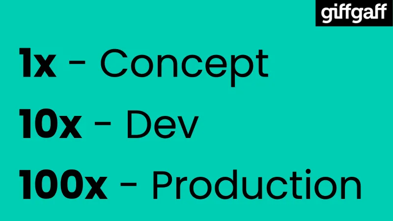
- “1x: Concept”
- “10x: Dev”
- “100x: Production”
The numbers are in bold, and each line is bigger than the one before.
Slide 19
An illustration of two women smiling. One has brown hair in a ponytail and glasses, and wears a purple T-shirt. The other has long red hair with yellow tips, and wears a dark grey T-shirt reading “Starlight Band”.
Slide 20
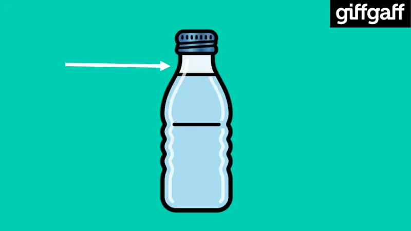
An illustration of a bottle of water, with a white arrow pointing at its narrow neck.
Slide 21
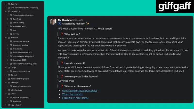
On the left, the contents of giffgaff’s accessibility space in Confluence:
- “Overview”
- “Four Key Principles of Accessibility”
- “Technology”, with “Technology Best Practices”, “Guidelines”, “Manual testing”, “Automated testing”, “App” and “Security”
- “Webinars”, with “Purple Tuesday 2024”, “Knowledge sharing”, “Discussions”, “Accessibility series 2021”, “Disability Pride Month 2025”, “Bupa cover 2025” and “Accessibility Culture Day 2025”
- “Design”, with “Design Best Practices”
- “Content”
- “Accessibility Highlights”
- “Meetings”, with “Meeting invite template”
- “Miscellaneous”
- “Office”, with “Physical accessibility” and “Quiet room”
- “Neurodiversity”
On the right, a weekly accessibility highlight I posted in Slack, headed “Accessibility highlight”. It reads:
“This week’s accessibility highlight is… Focus states!”
“What is it for? Focus states occur when we focus on an interactive element. Interactive elements include links, buttons, and input fields. You can focus on an element by clicking something that doesn’t navigate away or change your focus, or by using your keyboard and pressing the Tab key until that element is selected.”
“We need to make sure that our focus states also follow all the recommended accessibility guidelines. For instance, if a user with low vision uses a screen magnifier, then they may not be able to see context, so link or button text needs to be descriptive.”
“How do you use it? All our pre-built interactive components all have focus states. If you’re building or designing a new component, ensure that focus states are defined, following all accessibility guidelines (e.g. colour contrast, tap target size, descriptive text, etc.)”
“How supported is this feature? Fully supported”
“Where can I learn more?”, followed by three links: “Understanding focus state styles”, “Wise: Focus states” and “Focusing on focus states”.
Slide 22
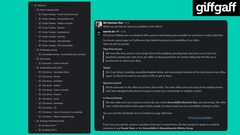
On the left, the list of recorded webinars and knowledge sharing sessions in Confluence:
- “Webinars”
- “Purple Tuesday 2024”, with “Purple Tuesday: Purple Pound overview”, “Purple Tuesday: Accessibility tools”, “Purple Tuesday: Design concepts”, “Purple Tuesday: Browser”, “Purple Tuesday: Development”, “Purple Tuesday: Security”, “Purple Tuesday: Neurodiversity” and “Purple Tuesday: PDF accessibility”
- “Knowledge sharing”, with “Knowledge sharing: Accessibility with Leanness”
- “Discussions”, with “Discussion: Autism & Gender”
- “Accessibility series 2021”, with “A11y Series: Accessible forms”, “A11y Series: Alt text”, “A11y Series: Animation”, “A11y Series: Buttons”, “A11y Series: Colour contrasts”, “A11y Series: Content”, “A11y Series: Focus”, “A11y Series: Semantics”, “A11y Series: UX”, “A11y Series: Value of Inclusion: Accessibility” and “A11y Series: Ways of using the web”
- “Disability Pride Month 2025”, with “Kai Wong, Part 1” and “Kai Wong, Part 2”
On the right, a Slack conversation. I ask, “What can you tell me about accessibility in the office?”, and Marvin, an AI assistant shown as “marvin tst”, answers:
“Of course! Making sure our physical office space is welcoming and accessible for everyone is really important. I’ve found a great page on Confluence that details the physical accessibility of our office. Here are the key points:”
- “Step-Free Access: We have lifts that connect every single floor of the building, providing fully step-free access from the basement parking area right up to our office on the ground floor. It’s worth noting that the lifts use a touchscreen to select your floor.”
- “Toilets: All of our toilets, including accessible disabled toilets, are conveniently located on the same level as our office space, so there’s no need to use stairs or lifts to get to them.”
- “Spacious Layout: All the doorways in the office are at least 76cm wide. The main office area and many of the meeting rooms have been designed with plenty of space to easily turn a wheelchair or mobility scooter.”
- “In-Person Events: We also make sure our in-person events, like our recent Accessibility Research Day, are welcoming. We often have a dedicated observation space where people can drop in and see our accessibility testing in action.”
“You can read the full details on our Confluence page right here: Physical+accessibility. If you have any specific needs or questions that aren’t covered here, the best people to speak to would be someone in our People Team or the Accessibility & Neurodiversity Affinity Group.”
Slide 23
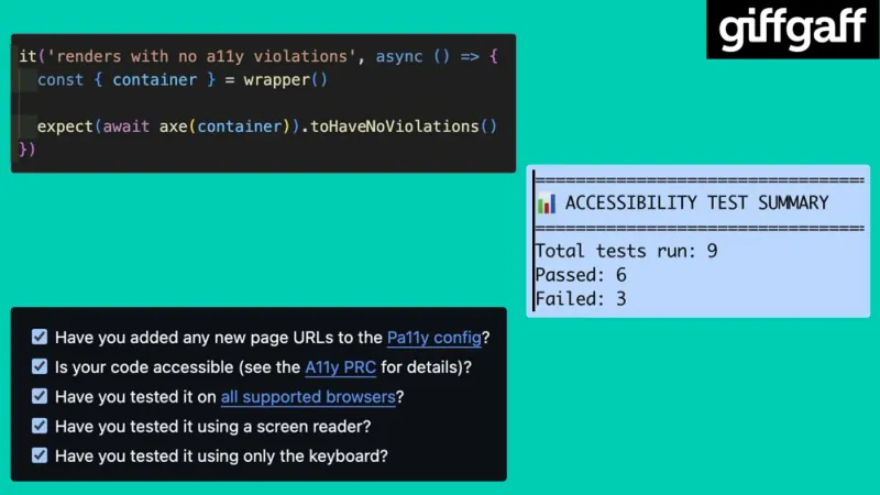
Three screenshots.
A unit test that checks a component with axe:
it('renders with no a11y violations', async () => {
  const { container } = wrapper();

  expect(await axe(container)).toHaveNoViolations();
});
An accessibility test summary from Pa11y: “Accessibility test summary. Total tests run: 9. Passed: 6. Failed: 3.”
A pull request (PR) checklist, with every box ticked. The first question is about uniform resource locators (URLs), meaning web addresses:
- “Have you added any new page URLs to the Pa11y config?”
- “Is your code accessible (see the A11y PRC for details)?” PRC stands for production readiness checklist.
- “Have you tested it on all supported browsers?”
- “Have you tested it using a screen reader?”
- “Have you tested it using only the keyboard?”
“Pa11y config”, “A11y PRC” and “all supported browsers” are links in the checklist.
Slide 24
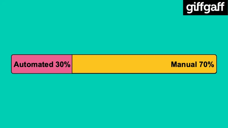
A bar split into two parts: a smaller pink part on the left reading “Automated 30%”, and a larger yellow part on the right reading “Manual 70%”.
Slide 25
Three people, shown as simple outline icons arranged in a triangle.
Slide 26
One person, with a white arrow pointing to a group of three.
Slide 27
Two hands holding a globe, drawn as a simple outline icon.
Slide 28
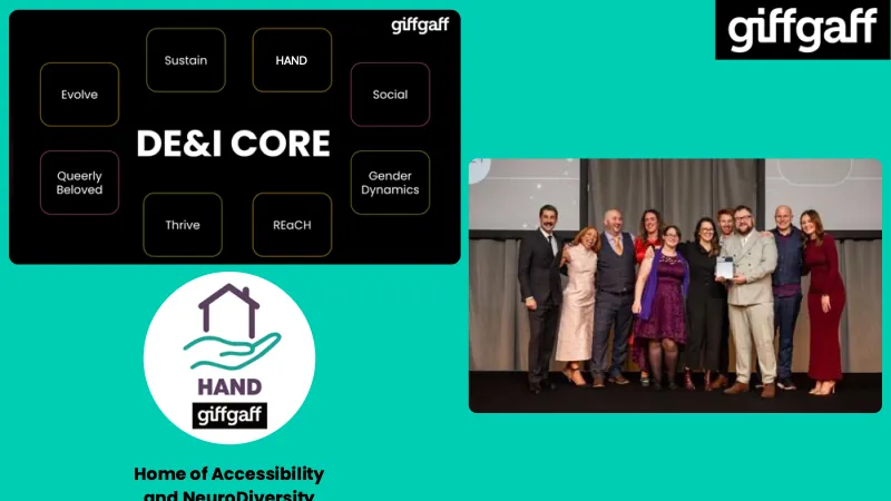
On the left, a diagram of giffgaff’s diversity, equity and inclusion groups, with “DE&I CORE” in the middle, surrounded by the names of the groups, including the Home of Accessibility and NeuroDiversity (HAND): “Evolve”, “Sustain”, “HAND”, “Social”, “Queerly Beloved”, “Gender Dynamics”, “Thrive” and “REaCH”. REaCH stands for Race, Ethnicity, and Cultural Heritage.
Below it, the HAND logo: a house outline above an open hand, with “HAND” and the giffgaff logo, in a white circle. Under the logo it reads “Home of Accessibility and NeuroDiversity”.
On the right, a photo of members of the groups on stage at an awards ceremony, one of them holding an award.
Slide 29
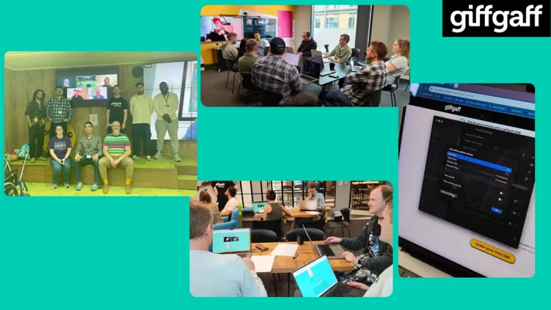
Four photos from the accessibility takeover:
- A group of ten people posing in front of a video wall, which shows more people joining on a video call.
- People sitting around a meeting room table with laptops, with people on a video call on a screen at the end of the room.
- People sitting in groups around tables in the office, working on laptops.
- A close-up of a laptop showing giffgaff’s website, with a button to order a free SIM card. The button reads “Order your free SIM”. The Mac accessibility settings window for Alternative Pointer Actions is open over the page.
Slide 30
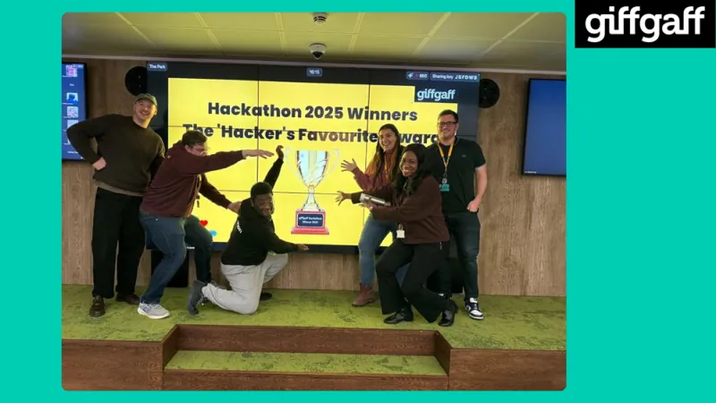
A photo of a team of six people celebrating in front of a big screen. The screen reads “Hackathon 2025 Winners. The ‘Hacker’s Favourite’ award”, and shows a picture of a trophy labelled “giffgaff Hackathon Winner 2025”. The team are posing and pointing at the trophy on the screen.
Slide 31
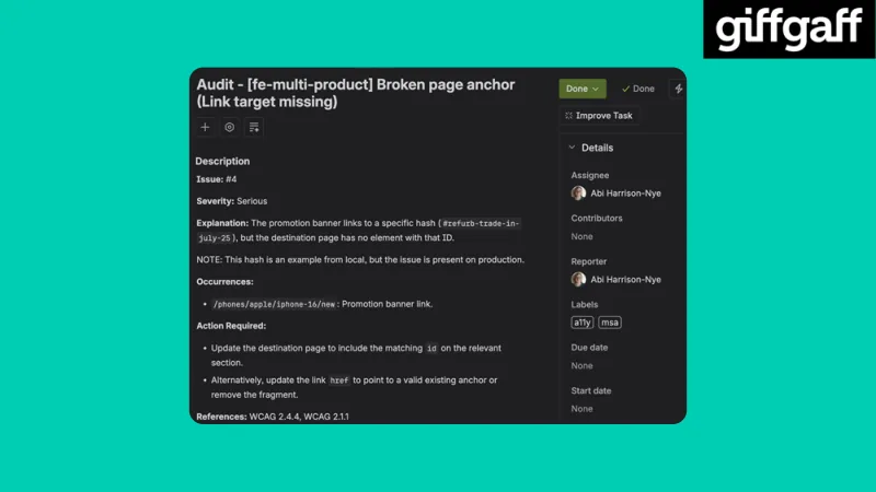
A Jira ticket from the audit, marked “Done”, with me as the assignee and reporter, and the labels “a11y” and “msa”. It reads:
“Audit: [fe-multi-product] Broken page anchor (Link target missing)”
- “Issue: #4”
- “Severity: Serious”
- “Explanation: The promotion banner links to a specific hash (
#refurb-trade-in-july-25), but the destination page has no element with that ID.” - “NOTE: This hash is an example from local, but the issue is present on production.”
- “Occurrences:
/phones/apple/iphone-16/new: Promotion banner link.” - “Action Required: Update the destination page to include the matching
idon the relevant section. Alternatively, update the linkhrefto point to a valid existing anchor or remove the fragment.”
The ticket’s references are to the Web Content Accessibility Guidelines (WCAG): “References: WCAG 2.4.4, WCAG 2.1.1”.
Slide 32
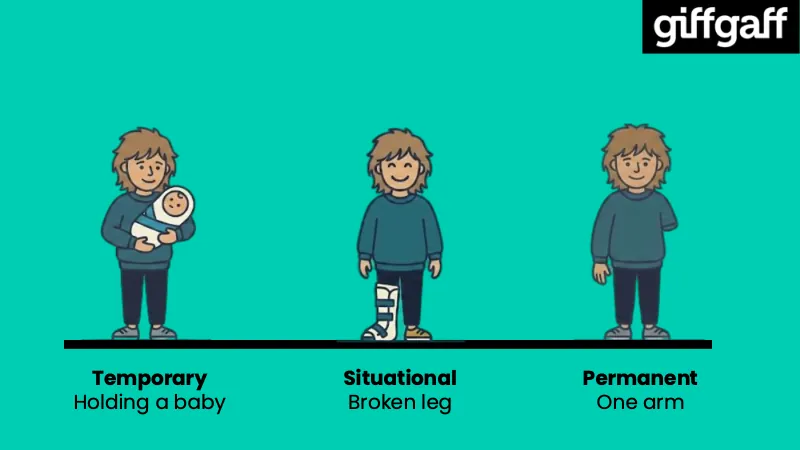
Three illustrations of the same person, standing on a line. Under them:
- “Temporary: Holding a baby”, showing the person holding a baby.
- “Situational: Broken leg”, showing the person with a brace on one leg.
- “Permanent: One arm”, showing the person with one arm.
Slide 33
Two hands clasping each other, like a handshake, drawn as a simple outline icon.
Slide 34
The word “Results”, in large, bold text.
Slide 35
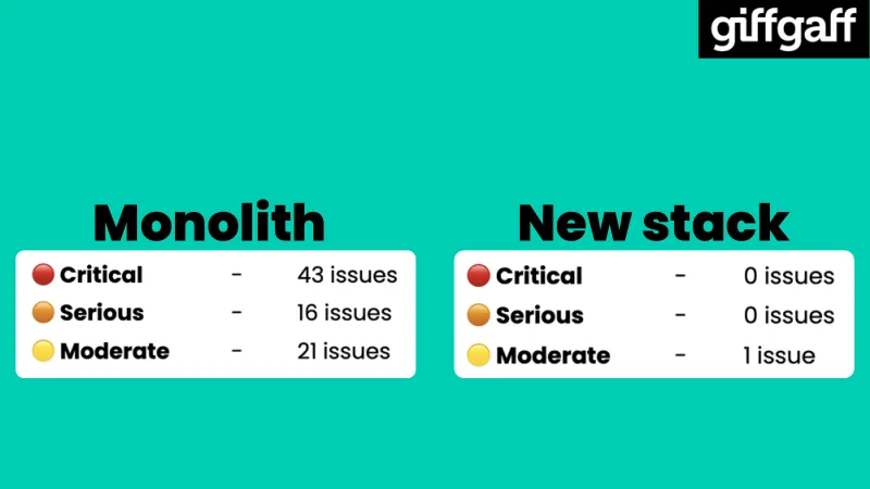
The audit results before and after, side by side.
“Monolith”:
- “Critical: 43 issues”
- “Serious: 16 issues”
- “Moderate: 21 issues”
“New stack”:
- “Critical: 0 issues”
- “Serious: 0 issues”
- “Moderate: 1 issue”
Each level has a coloured dot: red for critical, orange for serious and yellow for moderate.
Slide 36
A purple rubber stamp, set at an angle, reading “SHIP IT”.
Slide 37
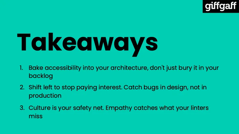
“Takeaways”
- “Bake accessibility into your architecture, don’t just bury it in your backlog”
- “Shift left to stop paying interest. Catch bugs in design, not in production”
- “Culture is your safety net. Empathy catches what your linters miss”
Slide 38
The giffgaff logo, large, with the tagline “we’re up to good” below it in large, bold text.
Slide 39
The title slide again, “Moving accessibility from debt to done at giffgaff”, with my name, Abi Harrison-Nye. On the right is a Quick Response (QR) code, with the web address “www.giffgaff.com/inclusion-toolkit” (external site) below it: giffgaff’s inclusion toolkit (external site).
Back to “Moving accessibility from debt to done at giffgaff”